
20 Minimal Korean Nail Art Ideas: Speckles, Nail Ink, and Quiet Details

A few irregular speckles, a translucent wash of gray, or a tiny line of silver can give a manicure character while leaving most of the nail open. Minimal Korean-inspired nail art often appeals through that balance: enough detail to notice, enough space to keep the result calm.
These 20 ideas focus on small organic marks and soft layers rather than large motifs. You will find sparse flecks, ink-like clouds, fine lines, and a few coordinated sets that repeat one detail across the hand. The aim is to choose a clear visual idea and let it remain visible.
For contemporary artist context, Allure’s Korean nail report includes nail ink. The suggestions below are original combinations to discuss with your own artist, with the product and application chosen for the manicure system being used.
Choose your version
Decide whether you prefer irregular marks or controlled geometry. Speckles and washes feel organic because they vary in size and edge. Dots and fine lines feel more deliberate and graphic. Both can be minimal, but they create different moods.
Then choose how much contrast you want. Brown over cream is gentler than black over white. Pale gray over a translucent base is quieter than a charcoal cloud. If you want the design to stay subtle, reduce contrast before reducing the marks so far that they become difficult to recognize.
| Your priority | Looks to consider | Detail to specify |
|---|---|---|
| Organic scattered marks | 1–4 | Few flecks and open space |
| Soft transparent color | 5–8 | Blurred edges and limited coverage |
| Fine graphic detail | 9–12 | One clear line or small point |
| Small abstract combinations | 13–16 | Related colors and restrained scale |
| A planned mixed set | 17–20 | Repeat one design rule |
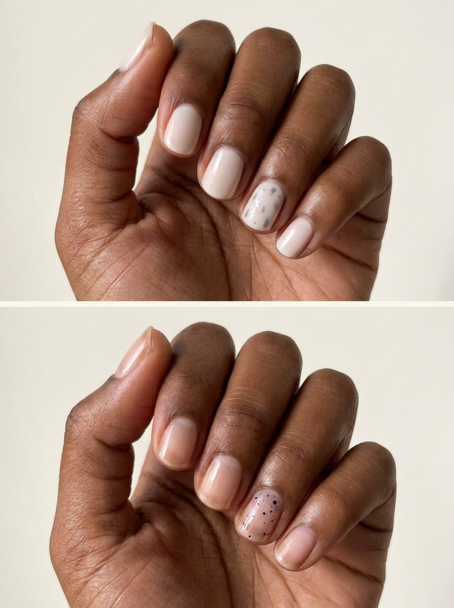
Sparse speckled nails
1. Cocoa speckles on warm cream
Scatter a few small cocoa-colored flecks over a warm cream accent nail. Vary their size and leave plenty of untouched base. The uneven marks give an organic appearance without turning the nail into a dense pattern.
Keep the other nails plain cream for a quiet set. Brown produces a softer contrast than black, making this a useful starting point if you like speckles but want them to remain understated.
2. Tiny black flecks on sheer beige
A handful of very small black flecks can add character to a translucent beige nail. The base remains visible through the open areas, keeping the result light. Use the pattern on only one or two fingers.
Avoid evenly spacing the flecks like polka dots. A few irregular gaps and changes in size are what distinguish this look from a regular dotted manicure.

3. Pale gray scattered marks
Use gray rather than black for a lower-contrast speckled effect. A softly milky base lets the marks show without making them harsh. Short rounded nails reinforce the gentle appearance.
Keep the gray deep enough to be visible in ordinary light. If the pattern disappears completely, a slightly stronger shade is more useful than adding many more flecks and losing the open space.
4. Speckled corner only
Concentrate a few dark flecks near one upper corner of an otherwise plain neutral nail. Let the pattern thin out as it moves inward. The partial placement feels lighter than speckles across the whole surface.
This is especially effective on short nails because it reserves most of the available space. Repeat the same general corner on two accent nails if you want a small rhythm across the hand.
Soft ink-like washes
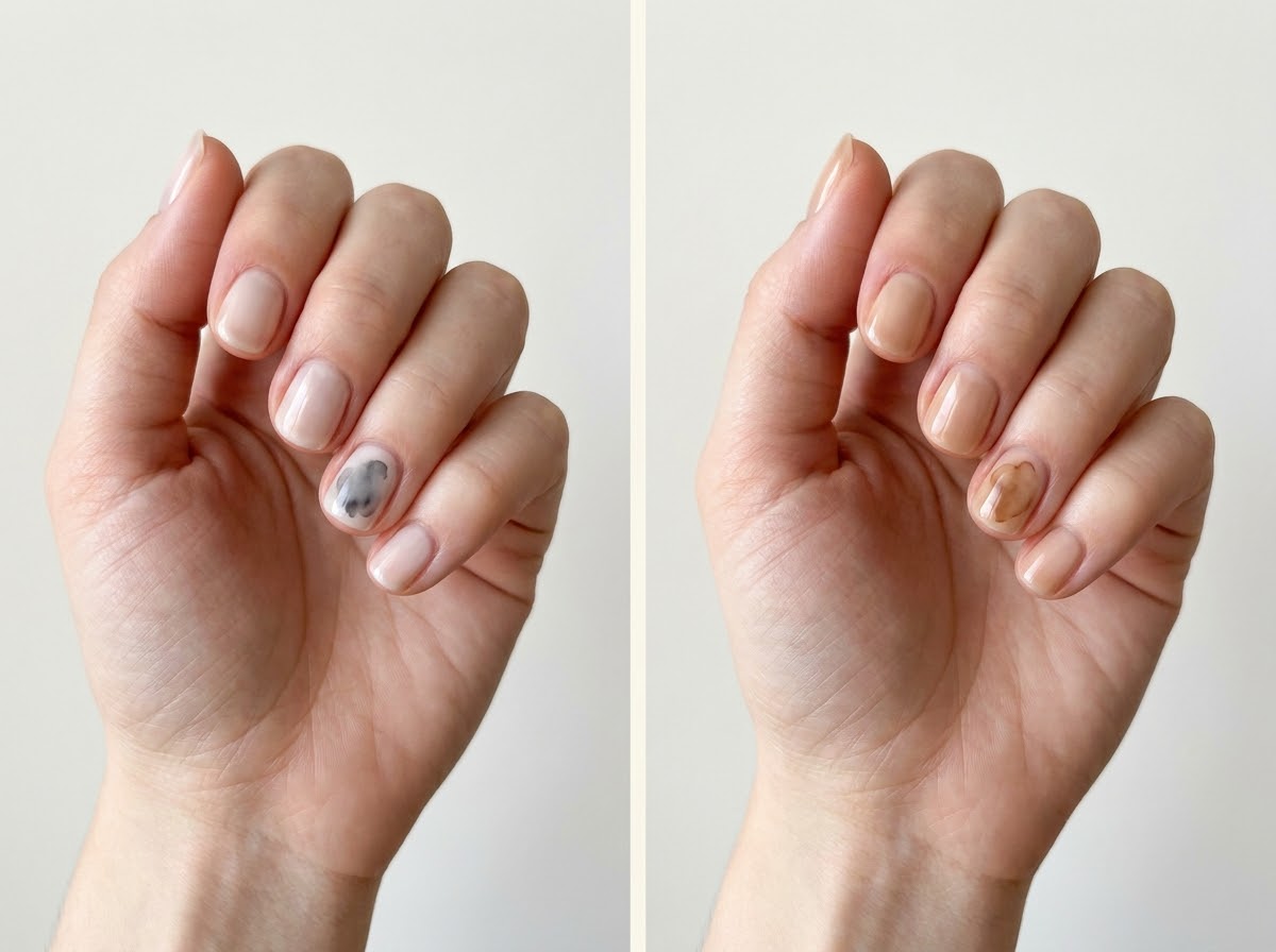
5. Soft gray ink cloud
A faint gray wash with irregular blurred edges creates a cloud-like accent on a translucent base. Keep the color light and leave clear areas around it. The design should feel abstract rather than like a realistic cloud illustration.
Use one accent nail if you want the effect to remain quiet. The surrounding plain nails make the soft variation easier to see without requiring a darker or larger wash.
6. Tea-brown watercolor wash
A translucent brown patch over a neutral base gives a warm watercolor-like effect. Let the edges vary gently and keep some areas lighter than others. The result is more fluid than a solid brown shape.
Ask for a small wash rather than a full marble pattern with dark veins. The warm color drift is the whole idea, and too many additional lines would change the mood.
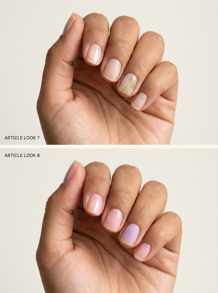
7. Pale olive ink-like drift
A soft olive wash placed toward one side of the nail adds a muted botanical color without painting a leaf. Keep the opposite side mostly clear. The asymmetry gives the design a relaxed, airy character.
Choose an olive that stays gentle against the base. A very dark green patch creates more contrast and may read as a bold abstract block instead of a subtle wash.
8. Lavender haze on clear-looking pink
A faint lavender cloud over a translucent pink base creates a cool, softly layered accent. The two colors should meet without a hard boundary. Keep the lavender limited to part of the nail so the base remains visible.
This is useful when you want color but no recognizable motif. A plain pink set around the accent keeps the palette coherent and lets the haze feel intentional.
Fine lines and small points
9. One hairline charcoal stroke
A single short charcoal stroke can sit slightly off-center on a nude nail. Keep it fine and stop well before the edges. The empty space around the line makes the small mark feel considered.
Choose a gentle diagonal or a vertical direction and repeat that decision if you use a second accent. Mixing several angles can become a busier abstract pattern, even when each individual line is thin.
10. Tiny silver dash
A short silver-colored dash near one side of a clear-looking nail adds a small flash of reflection. Leave the rest of the surface plain. The metallic contrast means the mark can stay very small and still be visible.
Keep the dash flat-looking and smoothly finished. A larger raised piece would move the manicure into jewelry-like decoration rather than the quiet graphic detail intended here.

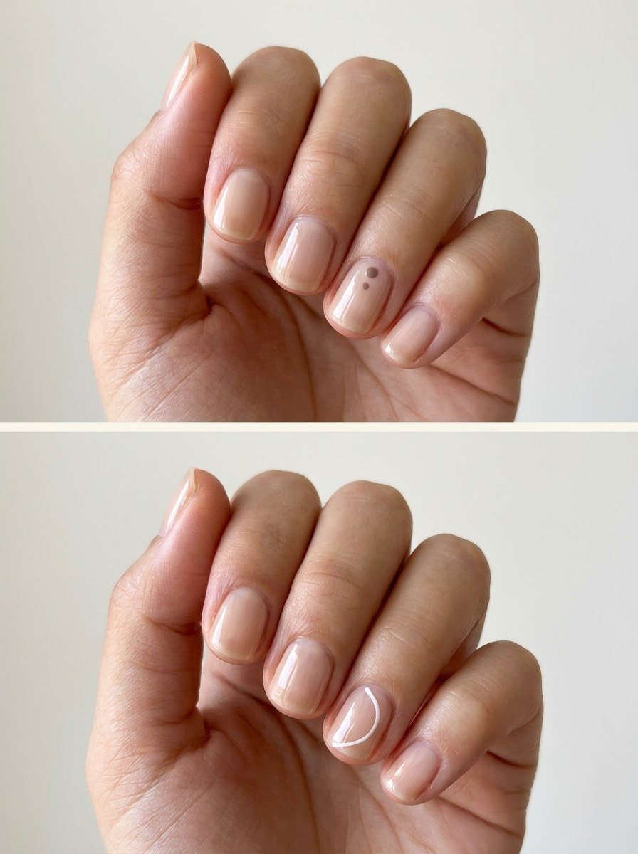
11. Two muted dots near the base
Place two tiny dots in related brown tones near the lower third of one nail. Keep a little space between them and leave a clear margin near the skin. The pair creates a simple rhythm without a full pattern.
Make one dot slightly smaller if you want an organic feeling. Equal dots in a straight row will look more geometric, so choose the relationship that fits the rest of the manicure.
12. Fine open white curve
A slender white curve over a translucent beige base gives a quiet abstract detail. Let it bend through one side of the nail without closing into a circle. Keep the line narrow and the shape small.
The curve should have a clear beginning and end rather than looking like an incomplete outline of the nail. An off-center placement helps it read as intentional art.
Quiet abstract accents
13. One gray wash with a brown fleck
Combine a small pale gray cloud with one darker brown fleck on the same accent nail. The wash supplies softness and the fleck provides a focal point. Keep the two details close enough to relate without overlapping completely.
Leave the remaining nails plain. The contrast between diffuse and precise marks is already enough of an idea, and repeating it everywhere can make the set feel much busier.
14. Cream patch with a tiny silver point
A small softly edged cream patch on a translucent nail becomes an abstract accent when paired with one silver-colored dot. The patch should remain modest and slightly irregular. The silver point adds definition.
Keep the base more transparent than the patch so the difference is visible. If both have equal opacity, the cream shape may disappear and leave only an unexplained metallic dot.

15. Soft beige wash with a fine line
A gentle beige wash and one short dark line create a minimal composition on a clear-looking nail. Position the line partly beside the wash rather than drawing through its center. The relationship feels more open and less like a symbol.
Use a soft brown line if black seems too strong. The goal is a small change in texture and definition, not a high-contrast graphic that dominates the hand.
16. Muted pink fragment on a neutral base
A small irregular patch of dusty pink gives a neutral nail one area of color. Keep the shape softly edged and avoid making it perfectly round. The abstract fragment can sit near a corner or along one side.
Repeat the pink as a plain tint on another nail if you want a more coordinated set. That creates a connection without needing to duplicate the same fragment on every finger.
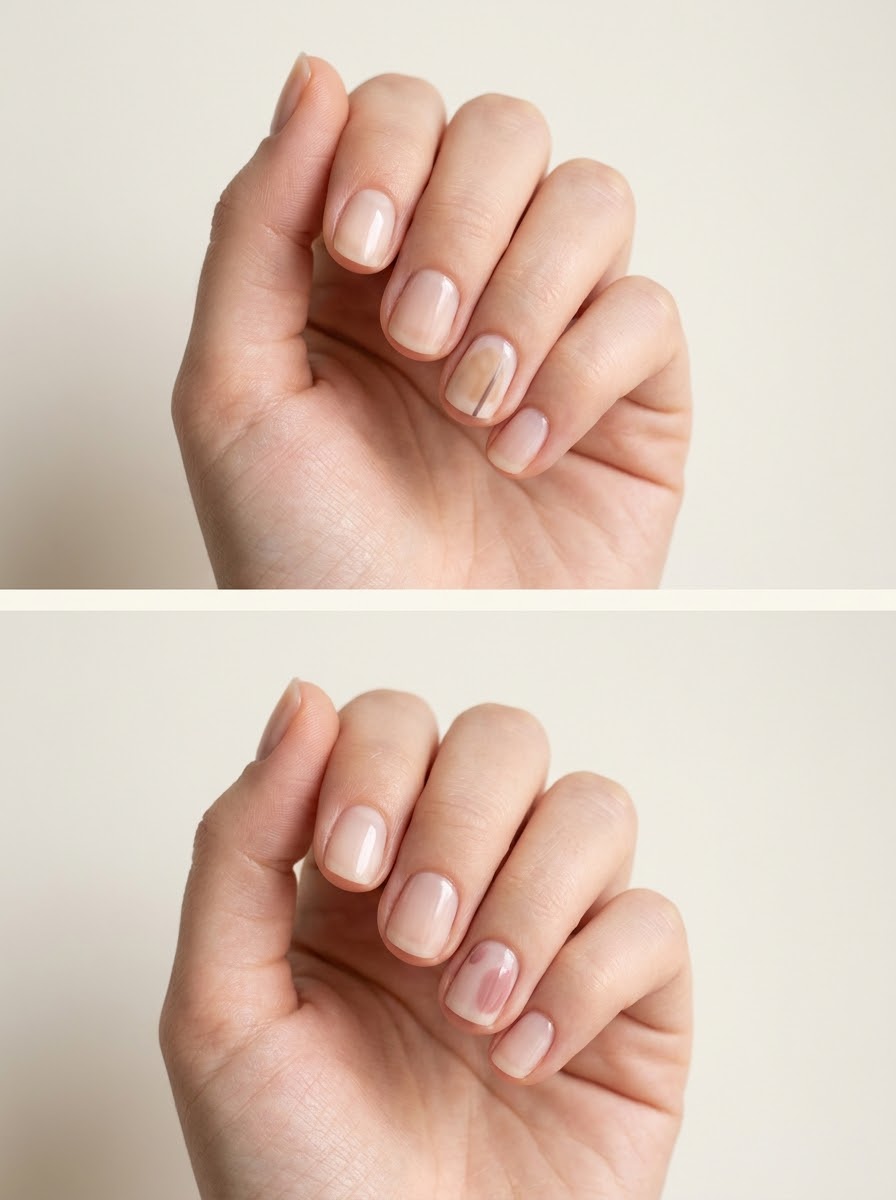
Minimal designs across a whole hand
17. Two speckled accents and plain cream
Use sparse brown speckles on the index and ring fingers, with plain cream on the others. The repeated pattern makes the set feel planned while leaving most of the hand quiet. Keep the speckles similarly sparse on both accents.
The cream should match across all nails. A different base under the pattern can work, but it adds another variable and makes the manicure less restrained than this simple version.
18. One ink accent with four sheer nails
Let one thumbnail carry a soft gray-lilac wash while the other four nails remain sheer neutral. The wider thumb provides room for the color to drift without filling the surface. Plain nails make the accent feel like a deliberate focal point.
This is a useful first experiment with ink-like art. You can decide how much variation you enjoy before choosing several different abstract nails at the next appointment.
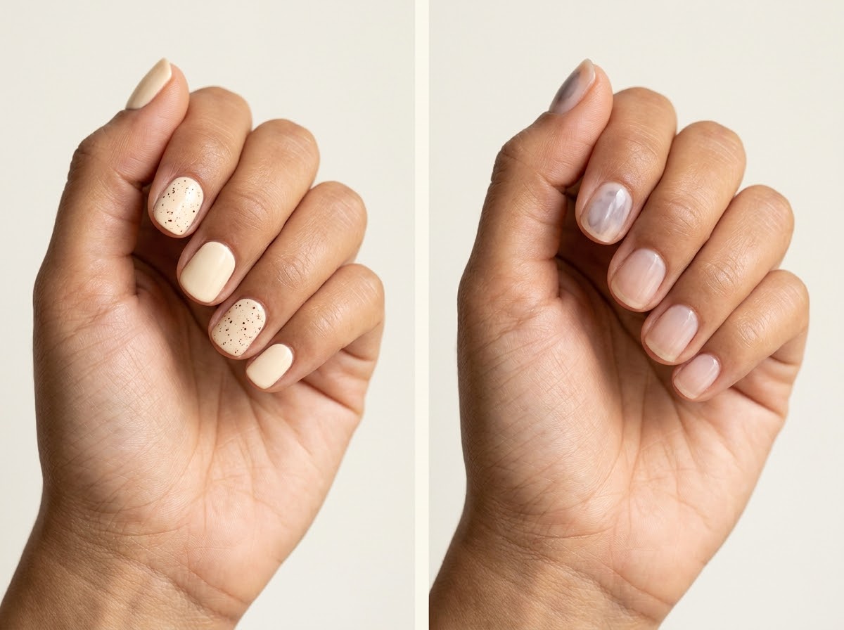
19. Alternating plain and finely lined nails
Add a short fine white line to two nails and leave the others plain translucent pink. Keep the lines in related positions so they feel like part of one design. The limited repetition gives the hand rhythm.
Choose line lengths that suit each nail rather than forcing identical measurements. A shorter mark on the pinky can have the same visual weight as a slightly longer one on the index finger.
20. Cream, tea tint, and one quiet speckle
Combine two plain cream nails, two translucent tea-colored nails, and one lightly speckled neutral accent. The warm palette connects the different appearances. Keep the speckles sparse so they do not overwhelm the plain colors.
Plan the finger order before painting. Repeating the same sequence on both hands creates a tidy set; shifting the accent positions gives a looser arrangement while preserving the shared palette.
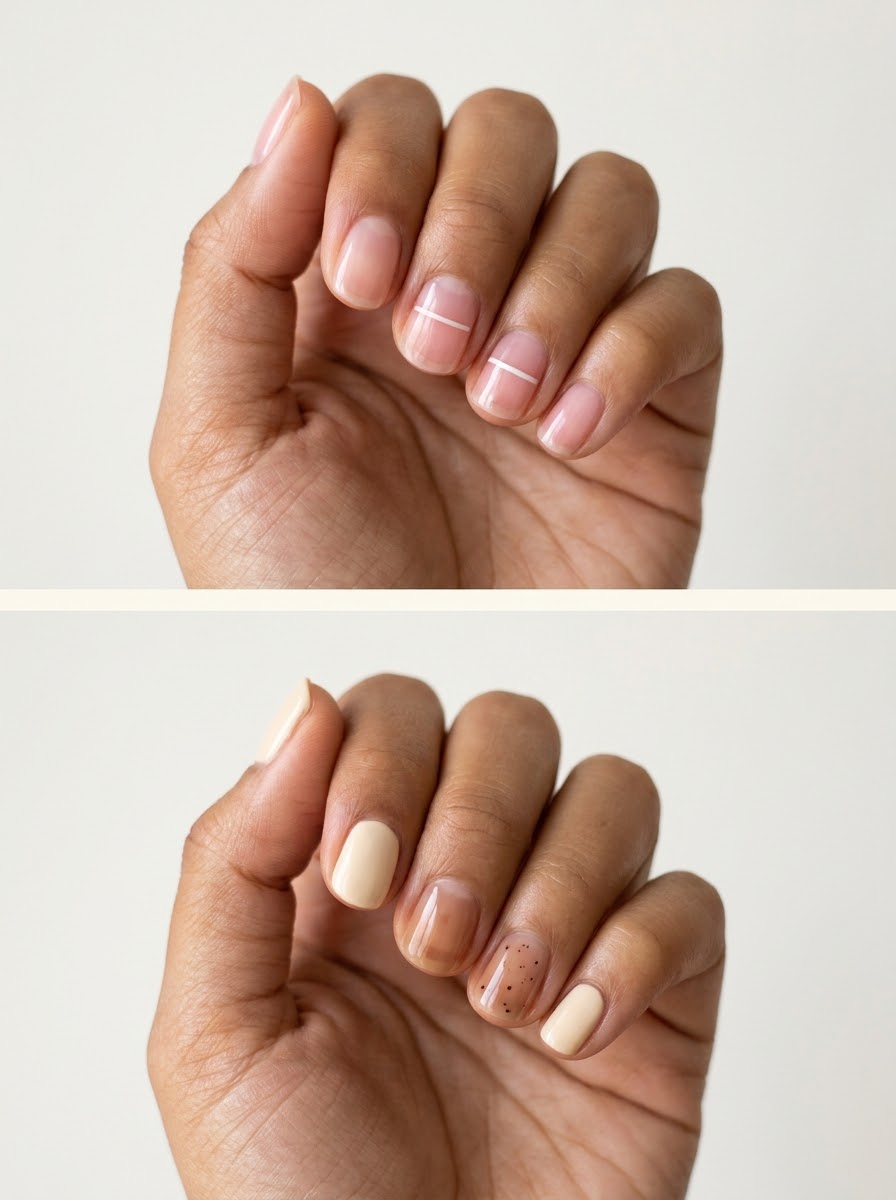
Use open space as part of the design
Choose the mark before the product
Describe whether you want a diffuse wash, a crisp dot, a fine line, or an irregular fleck. Nail inks, decorative gels, and regular polish do not all behave the same way. Let your artist select compatible products for the chosen system. A picture can communicate the appearance without requiring you to specify a technique you have not used.
Keep irregularity intentional
Organic marks should vary, but the set still needs a unifying rule. That might be one color, the same corner placement, or the same number of accent nails. Without a repeated element, a collection of unrelated marks can look accidental. Choose one rule and allow small variations within it.
Look at the whole hand
A single nail photographed close up may seem very simple, but repeating its design ten times can create a dense overall pattern. Before adding more art, look at the full set from a normal viewing distance. Plain nails are useful contrast, not unfinished spaces that need filling.
Build on an existing neutral manicure
If you already know your favorite base, keep it and change only the accent. Our short French ideas offer another way to use small lines, while the restrained motifs in our October nail inspiration can be reduced to one seasonal detail. For historical salon examples of speckled nail art, see Allure’s Seoul nail gallery.
Frequently asked questions
Does minimal Korean nail art have to be sheer?
No. A cream base with sparse speckles can be just as restrained as a transparent wash. Sheer bases create visual openness, but the number, contrast, and placement of the marks also determine how minimal the manicure feels.
What is the difference between speckles and polka dots?
Speckles usually vary in shape, size, and spacing, giving an irregular effect. Polka dots are more uniform and patterned. Both can be minimal, but they communicate different kinds of order.
Can I use ordinary craft ink for this look?
Choose products intended for the nail system and follow their instructions, or ask a qualified nail artist for an appropriate option. A watercolor-like appearance does not mean any art material is suitable for applying to nails.
How do I stop an abstract design from looking messy?
Limit the palette and repeat one placement rule. Leave plenty of plain base and keep only a few accent nails. If the design feels crowded, remove a mark or simplify the color relationship rather than adding another detail to compensate.
Save the mark you like most, then decide where it belongs and how much space it needs. The quietest manicure is often the one with a clear idea and enough restraint to let you see it.